Job: Stationery
Type: Company Identity
Client: Aeroseal Windos & Storefront
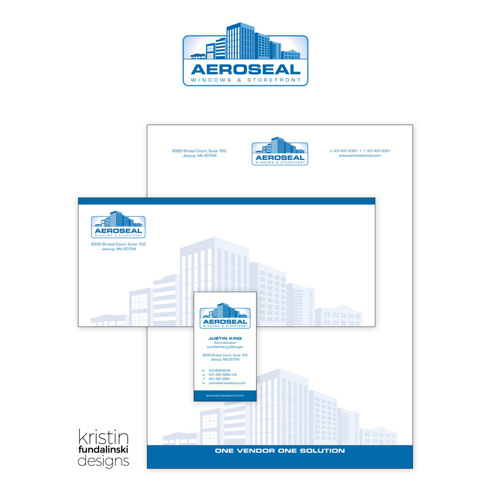
I created this stationery for Aeroseal, which is an exterior improvement contractor specializing in the replacement of windows, doors, railings, and storefront. They wanted their logo to look “big business” and their stationery to have a modern look to it. Since they work on many different types of buildings they wanted to have that suggested by featuring various types of buildings in their logo and as a watermark on the stationary. I created all the buildings and graphics from scratch to give the look they wanted.
Job: Stationery
Type: Company Identity
Client: Episcopal Dioceses of WNY
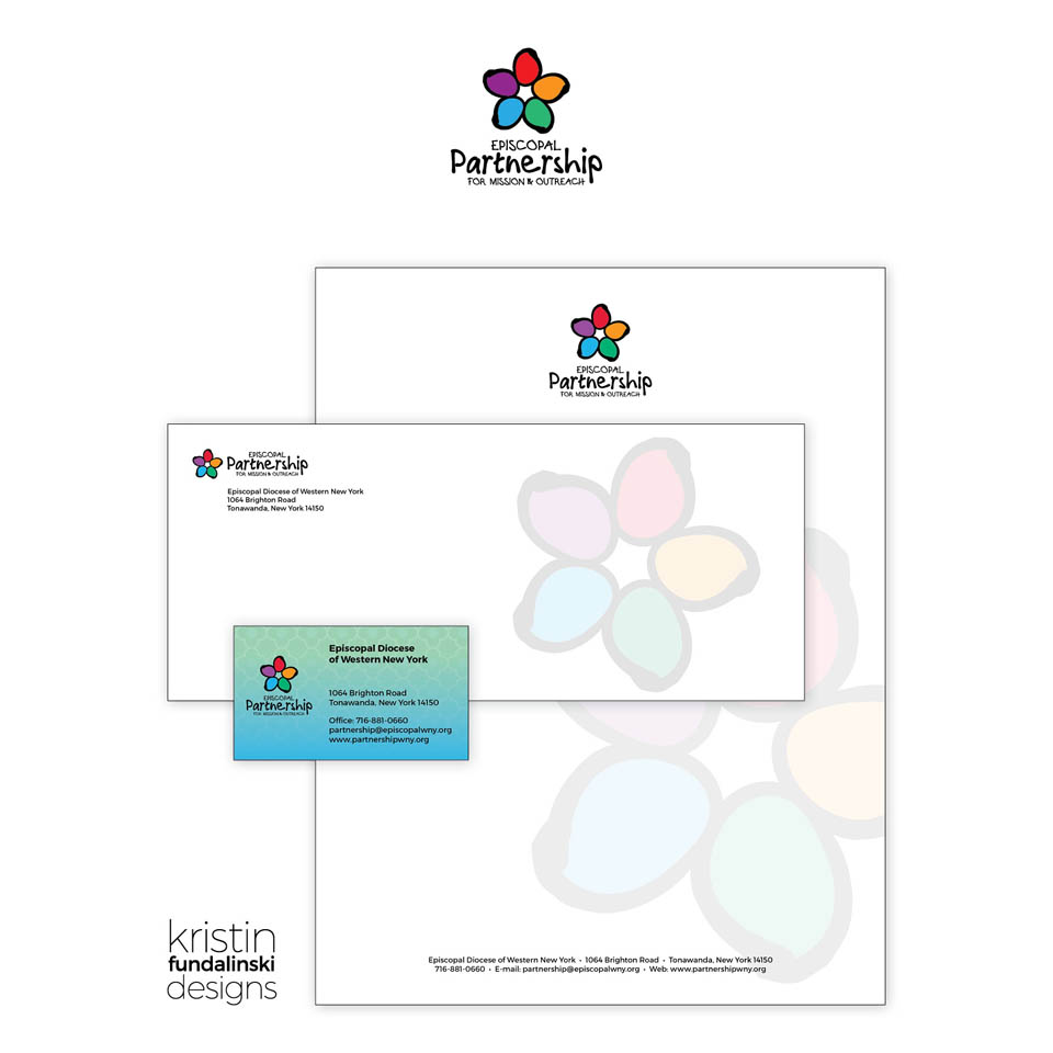
Description: This stationery set was created for the Episcopal Dioceses of WNY outreach program. This particular style follows a brochure I had created for them too, with the same color scheme. I created the logo for them as well.
Job: Stationery
Type: Company Identity
Client: Soma Cura Wellness Center
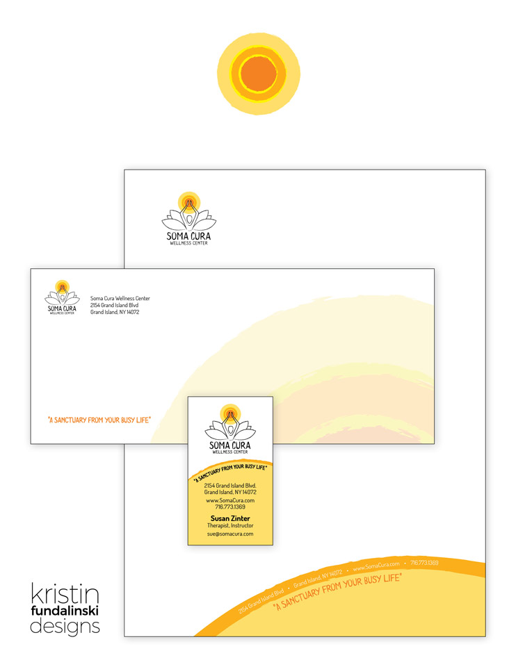
I created this stationery for Soma Cura Wellness Center. They wanted something that was warm and friendly, and that used the curve of their “sun” logomark. Soma wanted to have the fact that they have heated yoga rooms to resinate on their marketing materials, so I designed the “sun” to represent that.
Job: Business cards
Type: Company Identity
Client: Bart Taggart
This was business cards designed for the fine artist Bart Taggart. On the front I included images of 3 of his paintings, and on the back I included where his work can be purchased. The business cards are consistent with the look of the website he just had created. I used the fonts and logo from the site to keep everything consistent.
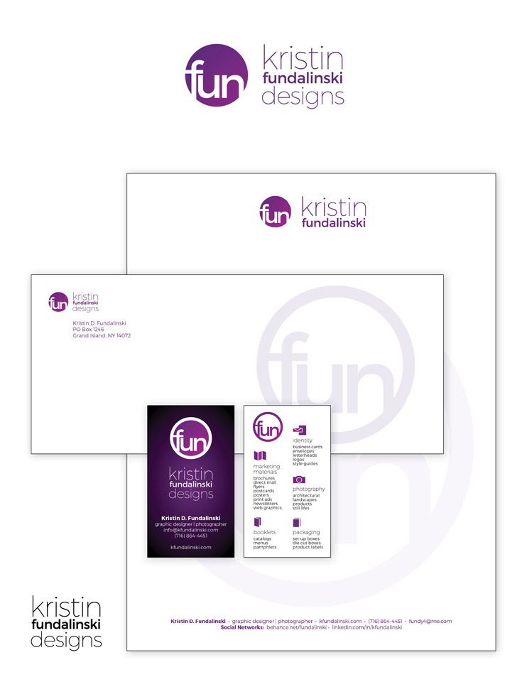
Job: Stationery
Type: Company Identity
Client: Kristin Fundalinski Designs
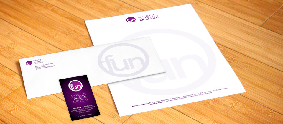
This is my own logo for when I do freelance work. I wanted to update my logo and stationery to be more modern. My former logo did not lend itself to the parameters of social media icons, so I wanted to design something that would work well cross-media. I used purple because it’s been my favorite color, since I was about 5 and read Harold and the Purple Crayon. For my stationery I wanted to have the business card be double-sided, with full bleed. On the back I include all my services.
Job: Logo
Type: Company Identity 2011
Client: kdfDesigns
This is my own logo for when I do freelance work. I wanted to use elements of “graphic” elements, so I chose to use the transformation handles that one would see in the Adobe applications, and also a selection arrow. I used purple because it’s been my favorite color, since I was about 5 and read Harold and the Purple Crayon. For my stationery I wanted to have the business card be double-sided, with full bleed. On the back I include all my services.
Job: Stationery concept
Type: Company Identity
Client: Discover Chiropractic
Description:
This concept design is for a chiropractic practice. Utilizing the word “Discover” in the company name, I used the “o” as a magnifying glass over an abstract spine graphic.
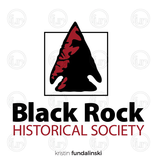
Job: Logo
Type: Corporate Identity
Client: Black Rock Historical Society
This was a freelance job to create a logo for the Black Rock Historical Society. They wanted to use an arrow head as their logo as the rock in the area was used as arrowheads.
Job: Logo Application Examples
Type: Corporate Identity
Client: Black Rock Historical Society
Job: Concept Stationery
Type: Corporate Identity
Client: Hibbard Home Improvement
Description:
This was a concept idea for a home improvement company I came up with. I wanted to develop a logo incorporating a house and tools. I chose to use a bold sans serif font because I wanted to denote strength.
Involvement:
Logo concept
Tool icon design
Layout design
Job: Stationery
Type: Company Identity
Client: Buffalo Games
Job: Logo
Type: Corporate Identity
Client: Millennea International Fine Art
I was commissioned, by a fine artist, to create a logo for his studio
Job: Stationery
Type: Corporate Identity
Client: Millennea International Fine Art
Collaterals
Identity