When giving your graphic designer text content, always remember that not every single inch of a layout needs to be filled with text. Figure out what’s the most important message to the reader and make it as simple as possible.
Graphic designers compose layouts in such a way to help the eyes flow from the most important item, to the next, and so on. This technique is called visual hierarchy. Understanding what the hierarchy is for a layout is a key to the success of it.
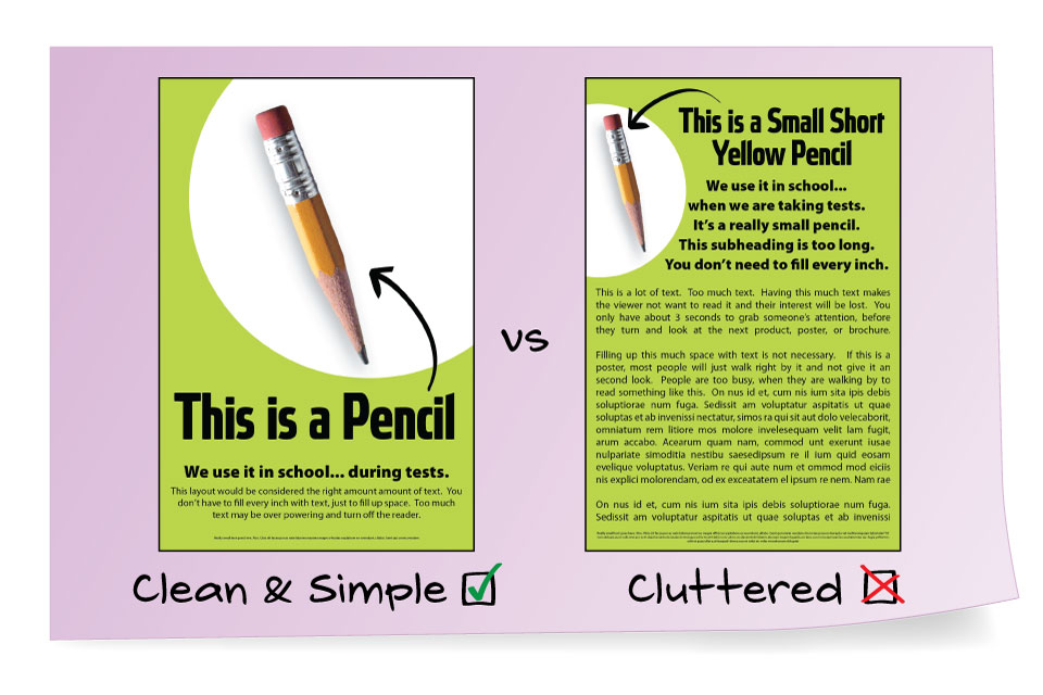
Your eye needs a certain amount of “padding” or “space” around a words and images, in order for your eyes to decipher them, and know where to look next. If everything has the same weight, importance, and every inch is filled with text/images, then everything starts to blend and become noise. Your eyes will naturally want to look away, which is not what we want, right? We want the reader to be drawn in and want to know more.
Letting your designer know what the most important verbiage is, will not only make your designers job easier, it will help ensure the success of the project. If you keep this idea in mind, when you’re giving your designer text content, then your marketing piece will have more success drawing in the reader, and thus selling your product or service.
Recent Comments