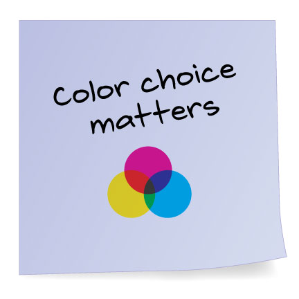
Lots of times I get asked “Which color should I choose?”
Color matters a lot and it’s very important to choose the right color, for your company or product. Every color means something different. For instance, red means love, immediacy, sale, and passion.
When Designers are composing their layouts, they are constantly thinking about how everything will fit together, and will effect everything as a whole. Color can influence our emotions, our actions and how we respond to various people, things and ideas.
For example, when I was working on the corporate style guide for NOCO, I chose to use green for their commercial materials and orange for their residential materials.
Here was the theory behind it:
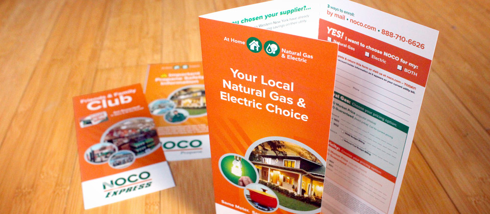
Orange:
Has very high visibility, so you can use it to catch attention and highlight the most important elements of your design. Orange is very effective for promoting food products and toys. Orange means vitality with endurance.

Green:
Symbolizes growth, harmony, freshness, and stability. Green has strong emotional correspondence with safety. Green has great healing power and is the most restful color for the human eye.
So when you choose a color, remember to ask yourself what emotion you want to evoke! 🙂
Recent Comments