
Why is consistency of company style important? Simply put, the more consistent your corporate style is, the more your company looks like it has it’s act together, thus looks more dependable and trustworthy.
All one has to do is look at successful companies. I like to use Apple, because they have a clean, modern style, and they had it for over 10 years now. They’re packaging has remained consistent, with black and white, the same fonts, and same basics layout. The same goes true for Target. Everything they do utilizes their red and white colors.
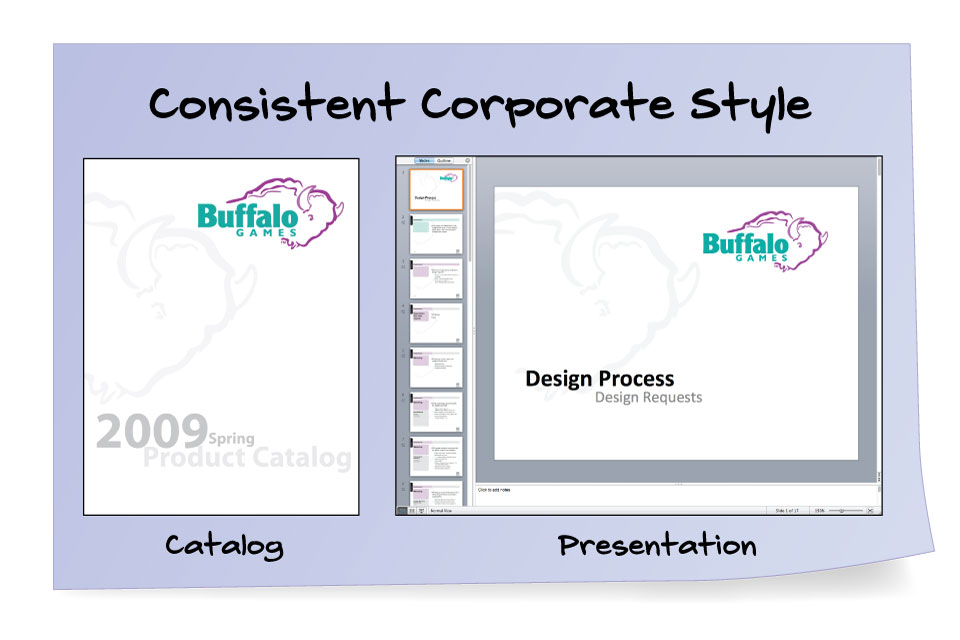
A definite misconception, that I’ve come across, is that all you have to do is have a logo slapped on to be constant. A corporate style is MORE than just the logo, it’s the fonts, colors, graphic elements, placement, and composition all together. When I was going through design school, one of the first things I was taught was to keep at least 3 graphic elements the same, such as logo, color and placement. The more things that are consistent, the better.
All too often I’ve heard over the years “I’m bored with this look” only after a brief time period, or “customers won’t notice it’s new if we don’t change things up”. My response is always to remember that your customers do not see your marketing materials as much as you do. For example, they may only see 1 or 2 mailings per year, opposed to you seeing them all the time on a daily basis.
Obviously if your style looks outdated, then modernize it. When you do though, choose a style that is more classic and won’t go out of style too quickly, then keep it consistent for at least 5 years.
If you keep a consistent corporate style, your company will benefit, because it will make your company be viewed as a strong brand, a company that knows who they are and what they are doing, and thus a leader!
Recent Comments